


Flyers are one of the most effective forms of advertising that never gets outdated. They are cost-efficient and easy to distribute. However, if you are new to this form of marketing, creating a flyer design for advertising can be complicated and challenging. In this article, we take you through the Do’s and Don’ts to make your flyers look more professional than ever.
The DO’s
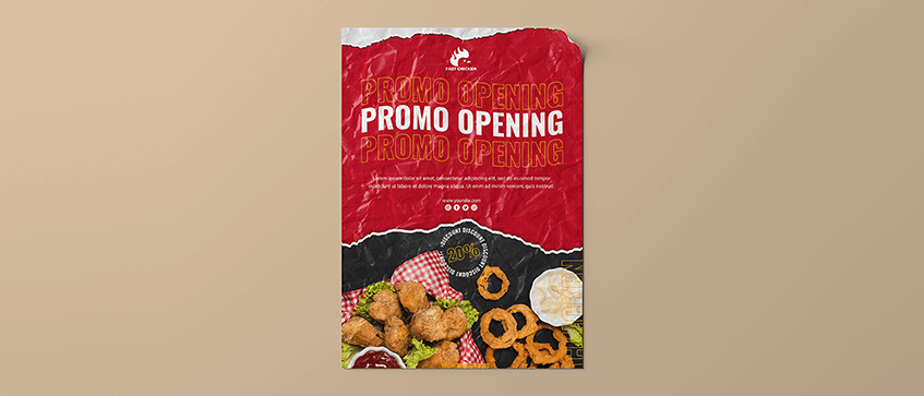
DO: Choose the right size for your flyer
For your flyer design, the size you select depends on the content of your flyer and how you plan to distribute it. If you intend to mail out your flyers, choose a size that can fit into a mailbox, such as A5 sized flyers. If you intend to stick your flyers on to walls, it is better to opt for bigger sizes like A3 sized flyers. Here in gogoprint, we offer a variety of sizes for flyers, from A3 to A6, and even DL sizes too!
DO: Use good quality paper material
When it comes to flyers, paper quality makes all the difference. Using good quality paper makes your flyer stand out more than just regular flyers. For example, instead of using normal simili paper to print flyers, you can opt for art cards and even add a nice finishing to it. Good quality flyers are also more durable plus it makes your flyers look presentable and professional. If you are looking for some variety of great paper materials, check out our website to choose your preferred paper!
DO: Let your flyer “breath”
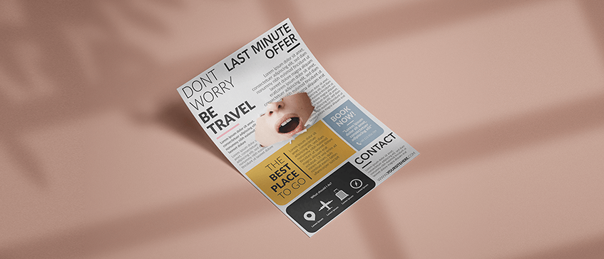
Depending on the design and size of your flyer, you should always give your design elements substantial space to breath. Otherwise you would overwhelm your potential customers by squeezing way too much information. In other words, don’t over-clutter your design!
For flyers, simple designs with straight to the point contents are usually preferred, because it makes it easier to get the message across.
The DON’Ts
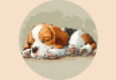
DON’T: Use blurry (low resolution) images
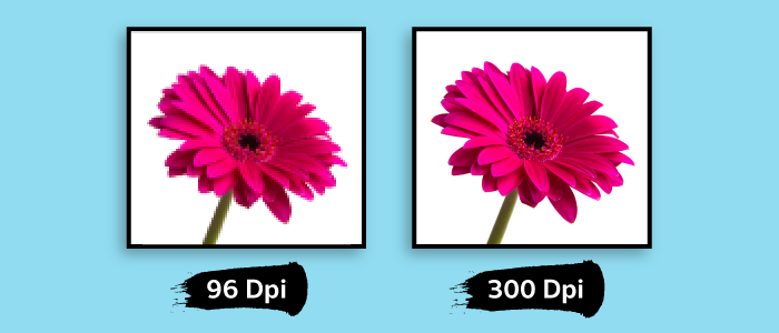
Image resolution is referred to as PPI or DPI, which are pixels / dots displayed per inch of an image. Low resolution images have little pixels / dots, and if those pixels / dots are enlarged, they can be seen like the image shown above, thus making the picture look blurry. For more information about image resolutions, check out our other article for a better explanation!
For flyers, pictures don’t just speak a thousand words, they are also eye-catching to people. A low resolution / blurry image will not only will make your flyer look like $#@!, it also can affect your brand image as a whole. Be sure that the images you use are in high resolution (at least 300dpi) to ensure that the printed result looks sharp and professional.
DON’T: Make your text difficult to read
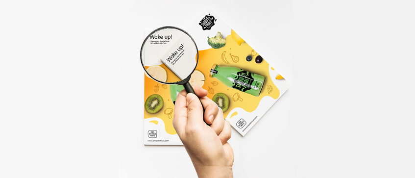
Text is the most important aspect in flyers. If your potential customers are unable to read your flyers, what would be the point of it? Choosing the right fonts in the right size (minimum 6pt) and colors is something that you need to think carefully. Making your fonts simple and easy to read is the safest bet to get the optimum result.
DON’T: Use the wrong color mode
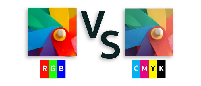
In the digital world of design, there are a few color modes to use when designing any artwork, which are mainly RGB or CMYK. To put it simply, RGB mode is mainly for digital use, while CMYK mode is best suited for printing. This is because the right color mode affects the color quality of your flyers. In the case of printing mediums, be sure to always use the color mode CMYK. Our previous blog has this topic covered, feel free to check it out here if you wish to know more about color modes!
Conclusion
With that out of the way, we hope you'll be well-equipped with the design and printing knowledge when you start creating your own flyer. In gogoprint, we offer a wide range of paper material, paper size and different finishing for flyers. While you are designing your awesome flyers, you can check out our website and start ordering said flyers on the fly! :)